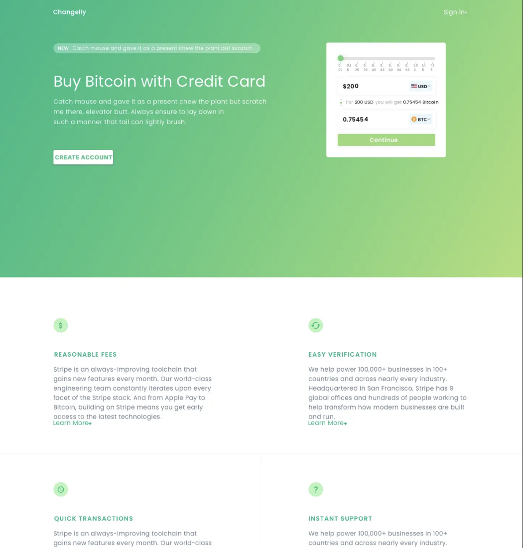
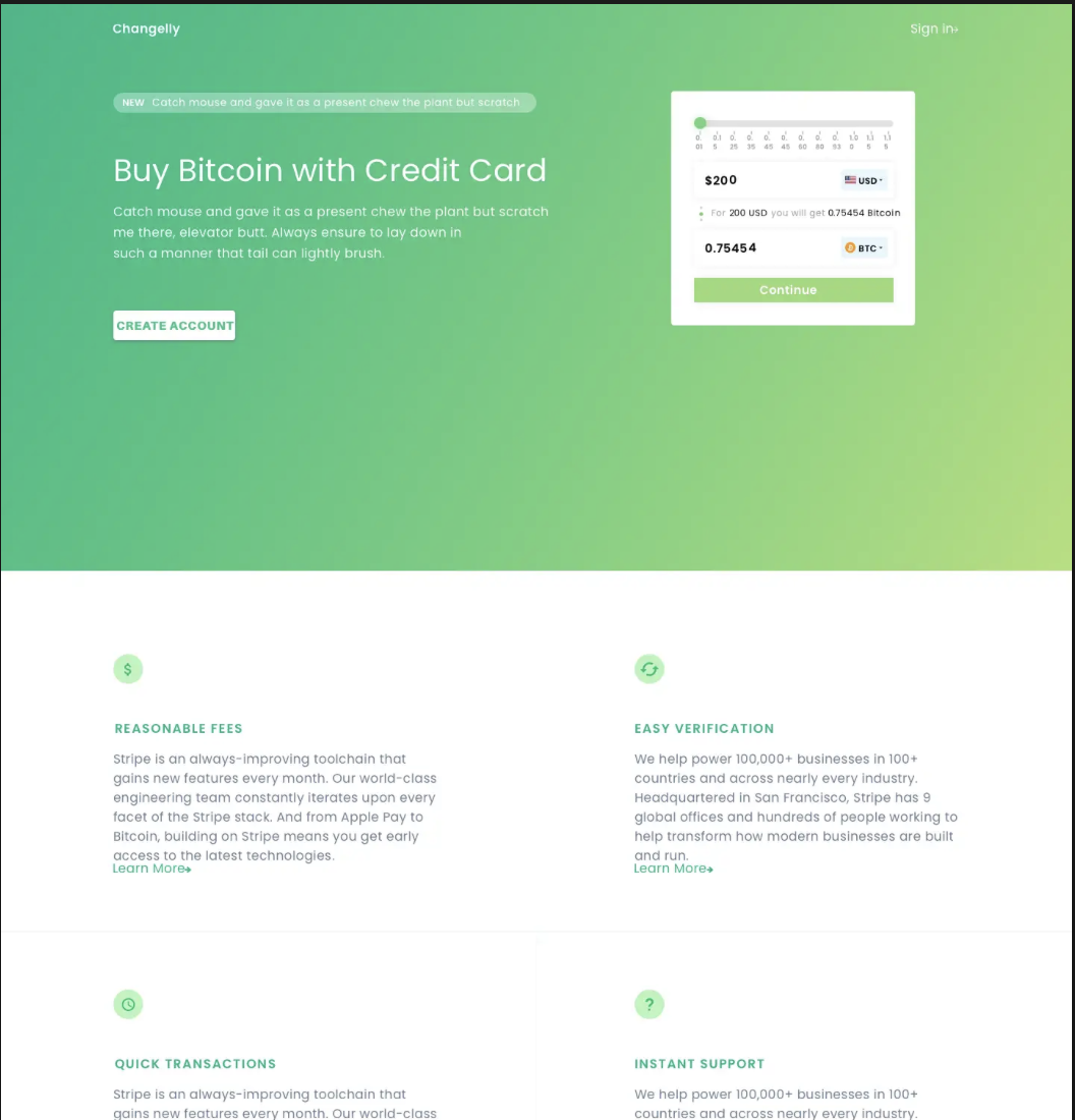
Study in Space
I rearranged the elements and adjusted the boxes to introduce additional negative space. As a result, the top of the page appears larger, more open, and visually balanced.
I revised the text for “Buy Bitcoin with Credit Card” and increased the size of the “Create Account” button to encourage higher user sign-up rates.
I enlarged the bottom text and standardized the margins to create a more cohesive page layout.
Before
After

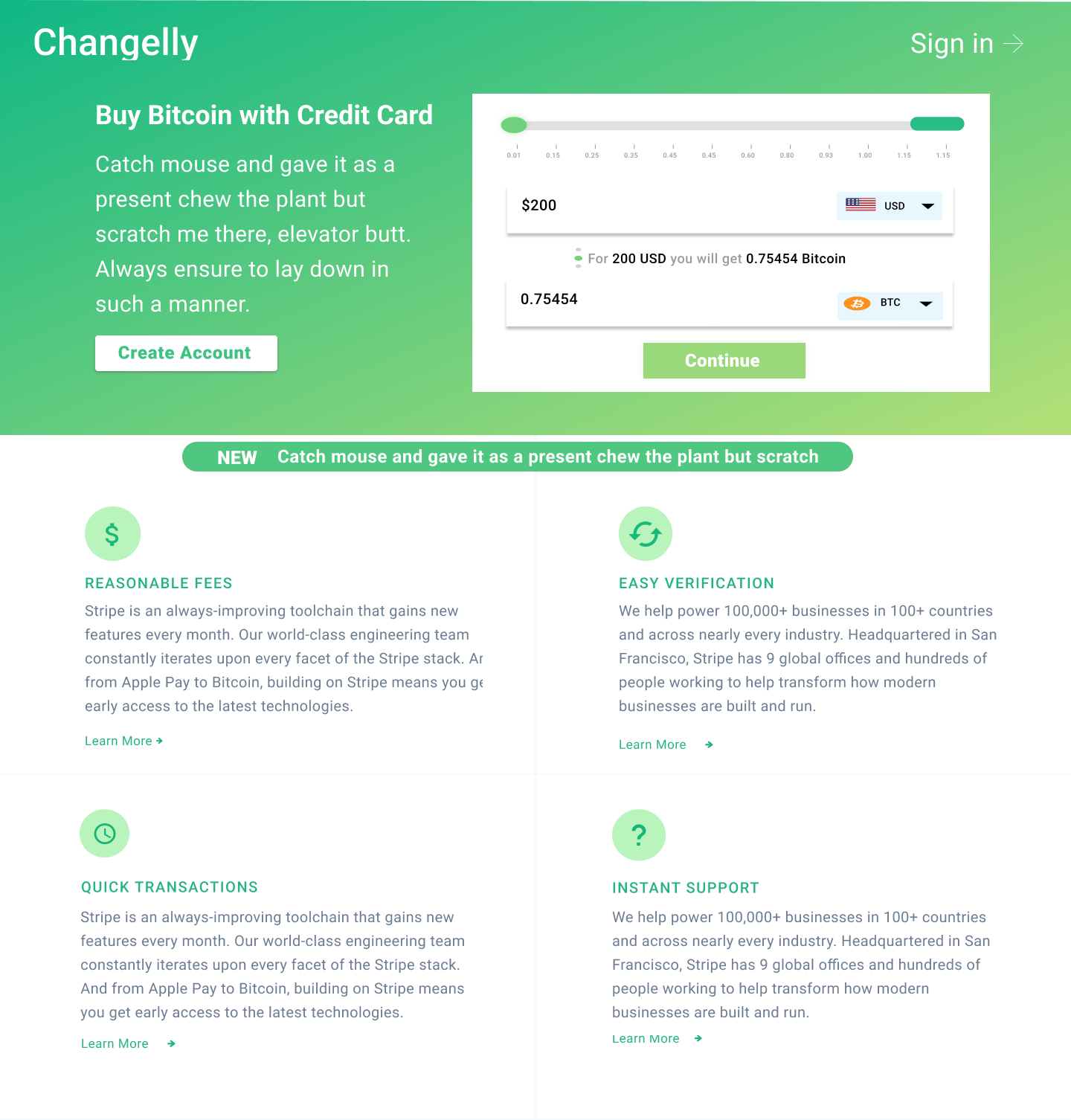
Study in Scale
I focused on employing scale as a design element to enhance readability. I repositioned the calculator to the right of the text, allowing users to encounter contextual information before interacting with the calculator, which improves the overall flow.
To minimize excessive white space, I increased the text size and expanded the calculator horizontally. Additionally, I increased the line spacing in the subsequent text to enlarge the paragraphs and achieve a more balanced distribution of white space.
I applied the golden ratio principle to guide these adjustments, resulting in a more coherent and effective flow of information.
Before
After
Study in Repetition
I focused on using repetition to improve the design. The “Suggested Projects, Activities, and Top Earners” categories use similar visual elements to show related information. Each category stands out with a consistent style, shown by how text and images are grouped in separate boxes.
To make the design easier to use, I highlighted the main action and avoided repeating colors, shapes, or sizes across different features. Using the same visual cues for the same actions is important because, without them, users might get confused or miss important differences.
I observed that the space between “Activity” and “Top Earners” in the earlier version. To fix this, I added more shapes and elements, created two clear categories, and moved them closer together to reduce extra white space.
Before
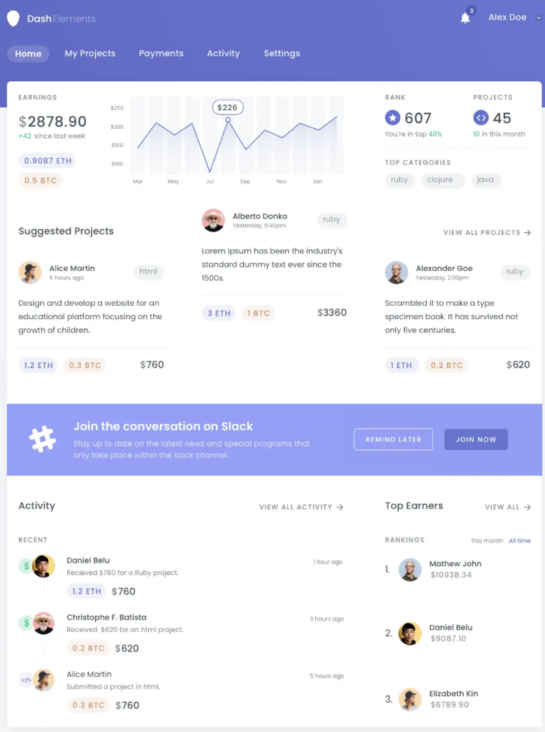
After
