Park Suite Case Study
Project Overview
Role: UX/UI Designer
Timeline: 8 weeks
Tools: Figma, Adobe Photoshop
Type: Capstone UX Project
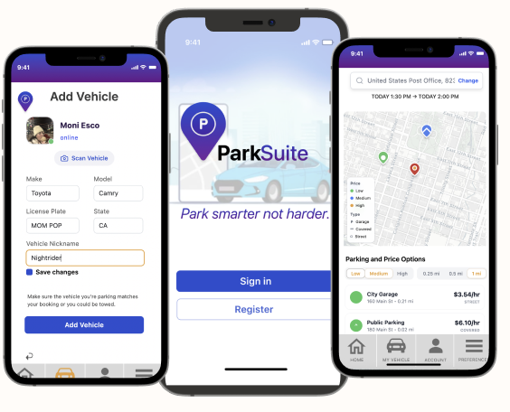
ParkSuite, parking locator app was an idea that started from the personal frustration of finding parking in the downtown area.
Research & Discovery
-
User Interviews (8 participants): Conducted interviews with regular urban drivers to understand pain points.
Surveys (17 responses): Gathered quantitative data on parking habits and frustrations.
Contextual Inquiry: Observed 4 users attempting to find parking in downtown areas.
Competitive Analysis: Analyzed 5 existing parking apps (ParkWhiz, SpotHero, ParkMobile)
-
Insights: I found that although many of the people I interviewed some personas had different motivations and goals when locating a parking spot.
Primary: Lisa, The Practical Commuter
Drives to work 5 days/week in downtown area
Values predictability and wants to pre-book spotsFelicia: The Cautions Urbanite
32-year-old who drives into the city for events.
Values price comparison and clear directions -
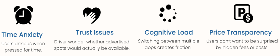
Time Anxiety: 73% of users reported feeling stressed when searching for parking, especially when time-constrained
Price Transparency: Users wanted upfront pricing without hidden fees or surprises
Trust Issues: Many users expressed concern about whether advertised spots would actually be available
Cognitive Load: Switching between multiple apps (parking, maps, payment) created friction
Last-Mile Problem: Finding the exact parking entrance was consistently problematic
Design Goals
-
Reduce search time by providing real-time parking availability
-
Increase transparency with upfront pricing and facility details
-
Streamline payment through integrated mobile payments
-
Improve wayfinding with turn-by-turn navigation to parking spots
Design Solutions
-
The app opens with a clear value proposition and streamlined account creation. Users can sign up via email or Google account with minimal friction, getting them to the core functionality quickly.
-
Users can search by:
Current location
Specific address or destination
Time range (immediate or future booking)
Price range and parking type
Amenities (covered, EV charging, security)
-
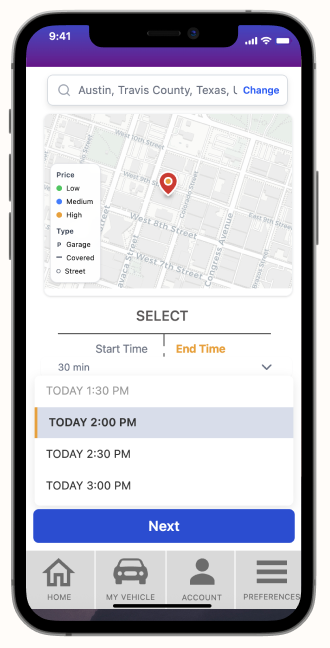
The booking interface minimizes steps:
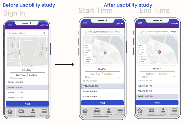
Select start time and end time with intuitive time picker
View total cost calculation in real-time
One-tap confirmation with saved payment method
Instant booking confirmation with QR code.
-
Created a sitemap prioritizing three core user flows:
Quick search and book (power users)
Explore and compare (price-conscious users)
Navigate to spot (wayfinding support)
Contextual Inquiry: Observed 4 users attempting to find parking in downtown areas.
Competitive Analysis: Analyzed 5 existing parking apps (ParkWhiz, SpotHero, ParkMobile)
-
Problem 1: Users waste time driving around looking for available parking
Solution: Real-time availability map with color-coded indicators
Implemented an interactive map showing parking locations with green (available), yellow (limited), and red (full) markers
Added filter options for price range, distance, and spot type (garage, street, lot)
Included occupancy predictions based on historical data
Values predictability and wants to pre-book spots
Felicia: The Cautions Urbanite
32-year-old who drives into the city for events.
Values price comparison and clear directions -
Problem 2: Price comparison requires opening multiple apps and websites
Solution: Unified pricing display with transparent fee breakdown
Designed comparison cards showing total cost including all fees
Added "Best Value" and "Closest" badges to help decision-making
Integrated sorting options (price, distance, rating, availability)
-
Problem 3: Users struggle to find parking entrances once they arrive
Solution: Turn-by-turn navigation with entrance-specific directions
Partnered navigation flow with visual cues for parking entrance
Added photo references of entrances from street view
Implemented proximity alerts: "You're approaching your parking spot"
Process
-
8 participants (mix of user personas)
Task-based testing scenarios
Think-aloud protocol
Post-test interviews and surveys
-
Successes:
100% task completion rate for primary booking flow
Average booking time: 47 seconds
"Very easy" rating: 87.5% of participants
High satisfaction with map interface and visual design
-
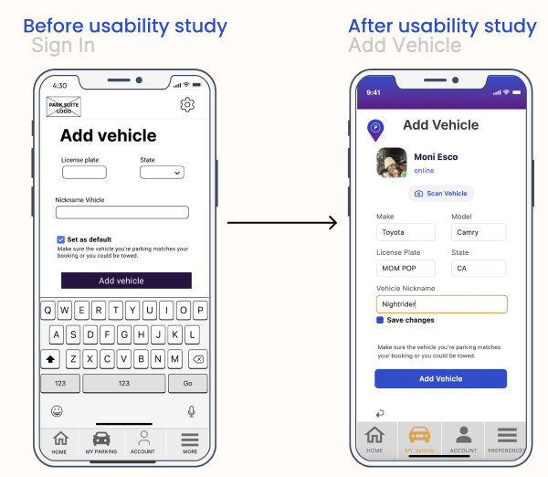
Users wanted ability to compare multiple spots side-by-side
Confusion about parking spot numbering in large facilities
Request for photos of actual parking spots, not just facilities
Desire for notifications about price drops or availability
Usability Testing
Challenges & Learning
-
Integrating real-time availability from multiple parking providers
Ensuring accurate GPS positioning in urban canyons
Balancing map performance with data freshness
-
Simplifying complex information without losing important details
Designing for various parking types (street, garage, lot, valet)
Creating intuitive wayfinding in multi-level structures.
-
Real-time data is critical: Users prioritize accuracy over additional features when it comes to availability information.
Visual hierarchy matters: In a map-heavy interface, strategic use of color and size helps users process information quickly.
Trust is earned through transparency: Showing all costs upfront, including fees, builds user confidence and reduces booking abandonment.
Context is king: Users need different information at different stages of their journey (searching vs. navigating vs. parked).
Conclusion
ParkSuite solves city parking problems by focusing on good design, real-time information, and an easy-to-use mobile app. We listen to users and improve based on their feedback, so our solution stays simple, reliable, and enjoyable.